Learn basics of CSS grids.
One of the most powerful module introduced in CSS are Grids.


Hi there, here I'm trying to cover basics of CSS Grids for beginners, basically it would help one who are new to web development.
Why to learn Grids?
You must learn and know about grid as a front end web developer , because grids are awesome, grids are so powerful when you think of creating stuffs in-terms of layouts, In coming times Grids will be a automatic choice to use, as though it is not supported by many browsers but it is not going to vanish anymore, because it is a powerful property which controls complex layouts on screen in a magically way and which is maintainable and easy to use.
pre-requisite: should have some basic knowledge on html and css(flex property in css).
What is Grid?
let's get started with basics of css grids:
Grids are 2D(two-dimensional), it's represented in rows and columns.
Basic examples:
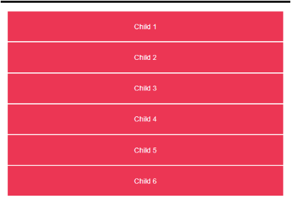
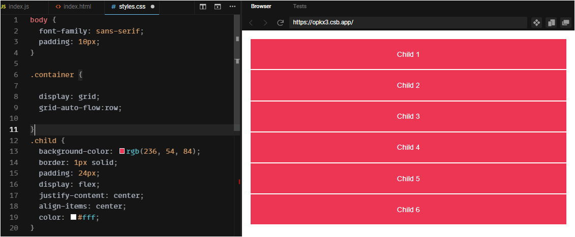
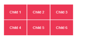
Here in html code, I have a container and inside that i have put 6 children,
 <div class="container">
      <div class="child">Child 1</div>
      <div class="child">Child 2</div>
      <div class="child">Child 3</div>
      <div class="child">Child 4</div>
      <div class="child">Child 5</div>
      <div class="child">Child 6</div>
    </div>
In order to use grids in css, first provide a property as display and value as grid.
display:grid
some of the grid properties with default values to remember
- grid-auto-flow : row
- grid-template-rows : none
- grid-template-columns :none
- grid-auto-rows : auto
- grid-auto-columns : auto
- grid-template-areas : none
In css file , i have given some basic styles to child and container class and used flex property for justifying-content and align-items as center.
body {
  font-family: sans-serif;
  padding: 10px;
}

.container {
  display: grid;

}

.child {
  background-color: rgb(236,54,84);
  border: 1px solid;
  padding: 24px;
  display: flex;
  justify-content: center;
  align-items: center;
  color: #fff;
}
Output 👇:
grid-auto-flow
when you use display as grid it will start creating grid and by default grid auto flow is row - by default browser is creating grids as rows. so there is one more thing to understand when you won't provide display as grid also the div tag here by default arranged inline block.
grid-auto-flow: row;

grid-auto-flow: column;
body {
  font-family: sans-serif;
  padding: 10px;
}

.container {
  display: grid;
  grid-auto-flow: row;

}

.child {
  background-color: rgb(236,54,84);
  border: 1px solid;
  padding: 24px;
  display: flex;
  justify-content: center;
  align-items: center;
  color: #fff;
}
Output 👇:
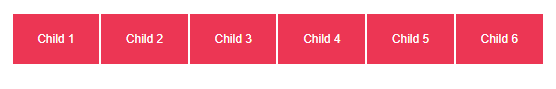
 to understand it better, here i have given grid-auto-flow as column👇
.container {
  display: grid;
  grid-auto-flow: column;
}
Output 👇:
please try out this in your code editors to know it better.
grid-template-columns, grid-template-rows
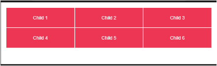
To create columns then we use grid-template-columns property, for example:
.container {
  display: grid;
  grid-template-columns: 100px 100px 100px;

}
output👇:
Here grids are created 3 columns with 100px each(which is provided in code explicitly) and as you observe by default browser created automatically 2 rows implicitly, this is the power of using grids in css, with only one line of code we created 2D layout.
DIY: try out by providing grid-template-row property with 2 values(100px,100px) to know it better, it might increase in height based on container's height , but layout remains same as 3 columns and 2 rows.
grid-template-columns with repeat( )
we can use other way to create columns by using repeat function, where you provide how many columns to create and how much space to occupy for each column in available width or space. see again in one line of code we can give specification to create rows and columns and there sizes to occupy in view-port, isn't it how grids are magical to use in css styling.
This snippet of code again provides same output as above, 3-columns and 2 rows:
.container {
  display: grid;
  grid-template-columns: repeat(3, 100px);
}
output👇:
we can also use (fraction) fr-unit here, which is basically divides available width equally to each columns, for example if we have 300px as available space , then 1fr will provide 100px to each columns.
.container {
  display: grid;
  grid-template-columns: repeat(3, 1fr);
}
Output 👇:
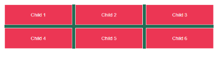
when it comes to row, we need to explicitly provide height to container, because we need to understand that container will occupy only entire width by default not the height, given some bg-color in below code to understand it better, you can see it already occupied available height in container. so not much changes when you provide grid-template-rows with 1fr unit without providing height to container.
.container {
  display: grid;
  background-color: rgb(33,109,84);
  grid-template-columns: repeat(3, 1fr);
  grid-template-rows: repeat(2, 1fr);
}
Output 👇:
when given height:300px it occupied equally available space to the height of each row, when given in fraction(fr).
.container {
  display: grid;
  gap:10px;
  height:300px;
  background-color: rgb(33,109,84);
  grid-template-columns: repeat(3, 1fr);
  grid-template-rows: repeat(2, 1fr);
}
Output 👇:
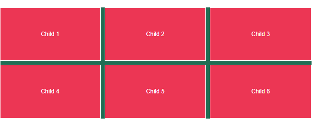
As we know by now that grid-auto-flow by default is row, when given grid-auto-flow: column explicitly in code to know it's flow, then you can see there is change in arrangement of children. child-1 and child-2 are positioned in 1st-column then rest children are arranged accordingly in next columns.
.container {
  display: grid;
  gap:10px;
  height:300px;
  background-color: rgb(33,109,84);

  grid-auto-flow: column;

  grid-template-columns: repeat(3, 1fr);
  grid-template-rows: repeat(2, 1fr);
}
Output 👇:
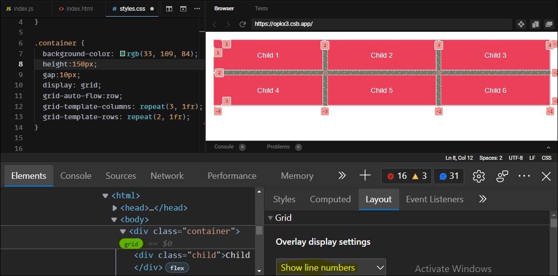
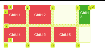
some css debug tips to know about grid layout:
When you try to inspect the layout of grid in devtools - by default grid will show in numbers where each grid cell will start and ends with positive and some negative values as shown below:
Output 👇:
We can also provide names to each grid columns as shown below: this will help in creating large projects which helps in code more readable.
.container {
  display: grid;
  gap:10px;
  grid-auto-flow: row;
  grid-template-columns: [col-1] 100px [col-2] 100px
  [col-3] 100px [col-3-end];
}
Output 👇:
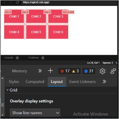
we can also use repeat() for naming - Try this out in your code editor => grid-template-columns:repeat(3,[col]1fr), which basically provide same name to each column.
grid-column and grid-row
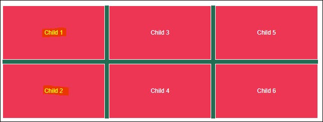
To re-position grids we can use grid-column and grid-row properties, for example: If we want to place child-3 as in place of child-1.
grid-column-start, grid-column-end
grid-row-start, grid-row-end
.child:nth-child(3) {
  background-color:rgb(54,168,44);
  grid-column-start: 1;
  grid-column-end: 2;
/*grid-column:1/2;*/
  grid-row-start: 1;
  grid-row-end: 2;
/*grid-row:1/2;*/
}
DIY: try this short-hand : grid-column: start/end, grid-row: start/end by un-commenting in above code and comment other grid properties-so that code is reduced by 2 lines, you will get same output as below.
Output 👇:

Grid areas
one of the powerful property in CSS grids are grid-area, which is again has many useful values bind to it, you will see as we follow in coming examples below.
grid-area: row-start/column start/row-end/column-end;
As you can see in below code using grid-area, we made code more shorter when compared to previous example and achieved same output.
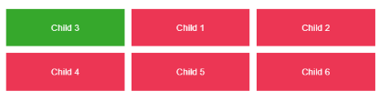
.child:nth-child(3) {
  background-color:rgb(54,168,44);
  grid-area: 1/1/2/2;
}
Output 👇:
- let's learn some of the cases where grids are created implicitly or automatically by browsers:
when grids are created implicitly or automatically as shown below, that we never said at first to create 4 columns, as given in code explicitly to create 3 columns - using repeat(3, 100px). but also as i said before grids are more powerful, we can create as much grids as per requirement later in projects,by implicitly or say browser is creating automatically grid area, grid cell and grid tracks as shown in below output for newly created grid in column-4 (green color) on a particular child element.
one more thing is important here that we should use grid-auto-columns to adjust the size of implicitly created grid area.
grid-auto-columns
.container {
  display: grid;
  gap:10px;
  grid-auto-columns: 50px;
  grid-template-columns:repeat(3,100px);
}

.child:nth-child(3) {
  background-color:rgb(54,168,44);
  grid-column: 4/5; /* grid which is created implicitly*/
}
output 👇:
I feel this would be much for newbies , so I am ending this blog with one last magically property in grids.
grid-template-areas
By default grid-template-areas is none and holds the itemnames given in quotes " ".
grid-template-areas: none|itemnames;
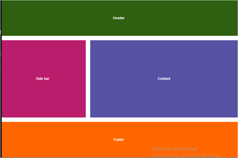
so this is the basic html file, where i created elements like header,main,side-bar and footer.
<!DOCTYPE html>
<html>
  <head>
    <title>css grids</title>
    <meta charset="UTF-8" />
  </head>

  <body>
    <div class="container">
      <header>Header</header>
      <main>Content</main>
      <aside>Side bar</aside>
      <footer>Footer</footer>
    </div>
    <script src="src/index.js"></script>
  </body>
</html>
In css file after given a some basic styles to it, i'm using grid-template-areas in container class and grid-area: itemname in each child elements, by default grid-area is auto.
grid-area: grid-row-start / grid-column-start / grid-row-end / grid-column-end | itemname;
basically,the grid-template-areas property specifies named grid areas, establishing the cells or automatically assign spaces according to named grid areas as shown below.
.container {
  display: grid;
  height: 100vh;
  grid-gap: 20px;
  grid-template-areas:
    "header  header header"
    "aside    main   main"
    "aside    main   main"
    "aside    main   main"
    "footer footer footer";
}
header {
  background-color:rgb(47,95,16);
  grid-area: header;
}
aside {
  background-color: rgb(185, 29, 107);
  grid-area: aside;
}
main {
  background-color: rgb(87, 82, 163);
  grid-area: main;
}
footer {
  background-color: rgb(255, 102, 0);
  grid-area: footer;
}
Output 👇:
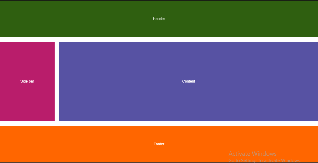
we can also use combination like grid-template-columns with grid-template-areas to explicitly provide how many columns needed in grid layout and we can give any name in grid-template-areas, as you see i have used name as "css" instead of "header" in below code snippet, but name should also match in grid-area provided in child class.
!important points to remember here is not use "span" and "auto" keyword while naming grid areas, because internally it is spanning areas to the available width, like for example when we use grid-column: 1/span 4; -> it is spanning area starting from column-1 to column-4.
.container {
  display: grid;
  height: 100vh;
  grid-gap: 20px;
  grid-template-columns: 240px 1fr;
  grid-template-areas:
    "css  css"
    "aside   main"
    "aside   main"
    "aside   main"
    "footer  footer";
}

header {
  background-color:rgb(47,95,16);
  grid-area: css;
}

aside {
  background-color: rgb(185, 29, 107);
  grid-area: aside;
}

main {
  background-color: rgb(87, 82, 163);
  grid-area: main;
}

footer {
  background-color: rgb(255, 102, 0);
  grid-area: footer;
}
Output 👇:
Grids are mainly used for layouts in 2D and they are more powerful when used with media queries, there are still more properties to learn when you deep dive into grids, as i said before i have only tried to cover basic things to know in css-grids and i also suggest you to try practicing it by coding then only you will know better usage of grid property in css.
Thanks for reading😊 !!
if you like it, please hit like button and provide your feedback in comment section.